


What’s The Difference Between Responsive Design And Dynamic Serving?
WHO DOESN’T WANT THEIR OWN WEBSITE TO LOOK APPEALING AND ENGAGING….
There is a persistent struggle to make a website look attractive on every device. It is an era where businesses have to actually decide whether the website should have a dynamic serving design or responsive design, instead of just putting things together and throwing a site. In order to decide which would work the best for a specific website’s requisites one has to understand the distinction between the two. Let’s have a look..
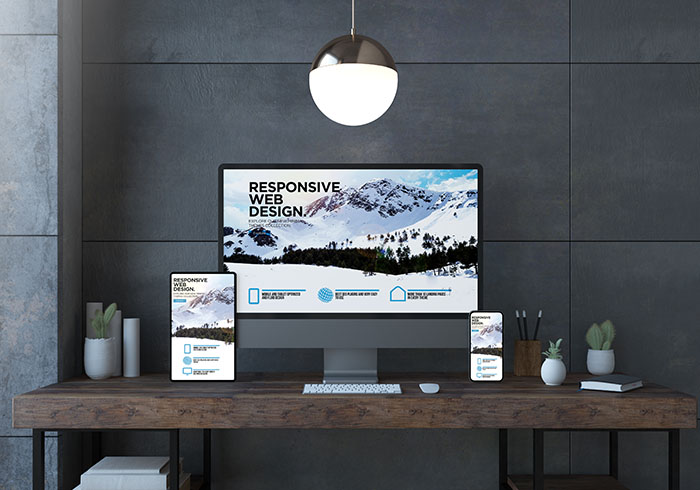
WHAT IS RESPONSIVE WEBSITE DESIGN?
According to Google’s definition, Responsive design is a website design that “serves [the] same HTML for one URL and uses CSS media queries to determine how the content is rendered on the client side.” In simple terms, your website without losing the overall feel and or design will adjust to the screen size on the device it’s being viewed.
Presently, Responsive Design is one of the most accepted and admired designs as it make any website easy to view. Web developers are also at ease when Responsive Design is used as they don’t have to design and create two separate websites, which lessens their work. Instead, only a second style sheet is required.
Though this is a very good design, there are few points of concern, which are overlooked.
Firstly, as it is Google’s recommended design, there is a presumption that it could give you a search engine rank bump. So not, true. Google’s ranking system is based on whether or not a website focuses on delivering an experience that is qualitative, that doesn’t mean choosing a responsive design gets you an “in.”
Secondly, Implementation of Responsive Design on other websites is difficult. Which leads to higher expenditure as one will have to redesign a website if it has not been done in the past few years
Lastly, the experience of a user never differs. It is considerable for designers having the same feel across all devices because they know their websites will always look a particular way. Some people will experience a responsive website differently than others because mobile devices are not the same (i.e., the design on one device could have better text readability but squish text into longer paragraphs on another).
MOBILE-FRIENDLY TEST – GOOGLE SEARCH CONSOLE
Test how easily a visitor can use your page on a mobile device. Just enter a page URL to see how your page scores.
https://search.google.com/test/mobile-friendly
WHAT’S DYNAMIC SERVING?
Dynamic is serving According to Google, will “serve different HTML for one URL depending on the user-agent.” In a simplified way, this means that depending on the viewing device you’re using you will get a “different” website and overall experience. By “different”, it means the website is designed specifically for each device.
You’re only using one URL as it is in Responsive Design. With multiple HTML files created to serve each device, the process a bit simpler by having, only one URL makes, especially for the user. you can target mobile users by using Dynamic serving design. Content that will only be seen when on mobile can be created as you have created an HTML website dedicated to smart phones. This gives search engines more results to find for mobile searches.
Dynamic serving is expensive. More time and money has to be devised as different HTML has to be created to serve different devices. Along with that, separate SEO plans have to be created in order to make sure each variation of the website is found and indexed correctly.
Google could accidentally take a mobile user to the desktop site or vice versa Sometimes, while detecting which device is being used which could frustrate site visitors and make them leave your site (and possibly not come back).
Responsive design over dynamic serving has been opted by more and more businesses online, which is understandable. It is based on unwillingness to spend more for many. For others, it could be because they do not know what dynamic serving is or what it can do. While opting for a design, remember that site visitors will be looking at your business’s website on different devices like smart phones and tablets frequently, so choose the best design that serves the best.